Lofoten’s new landmark
The Svolvær Goat rage in the highlands outside Svolvær. But down in the city, it has competition from the skyline of the Norwegian Fishermen’s Sales Organization, decorated with nautical charts, lighthouses and sector lines.
“The building was transformed from an ugly green spectre to the white swan of Lofoten.” This is how architect Ole Wiig, partner at NSW Arkitektur, explains the change process that he and his architects implemented when the building that houses the Norwegian Fishermen’s Sales Organization in Svolvær was renovated.
Run down
It was a run-down building, suffering from a need for long overdue maintenance. “The façades of this architectural gem were more characterised by a bygone era,” according to Wiig. The original dressed concrete building was later clad in corrugated sheet metal. “The Norwegian Fishermen’s Sales Organization asked us to do something about the building. The energy accounting for the building eventually became rather depressing reading, so the time was right for a change.”
It was natural to use Steni’s façade panels. Steni offers a wide variety of colours, gloss levels and sizes. I can hardly imagine that it would have been possible without Steni’s technology.Ole Wiig, Architect and Partner at NSW Arkitektur
The building welcomes you
“The Norwegian Fishermen’s Sales Organization now has a beautiful and majestic building in the middle of Svolvær,” says Wiig. It is barely a stone’s throw from the city square and is facing the Hutigruten quay, ready to welcome passengers as they arrive at the capital of Lofoten. “The name bears with it a certain responsibility, and the Norwegian Fishermen’s Sales Organization has really done something about it,” believes Wiig, saying that all the windows were replaced with high-quality energy-saving windows, and the building was post-insulated after optimisation assessments.
Filled the gable wall
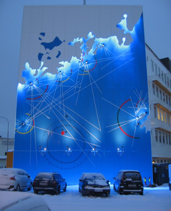
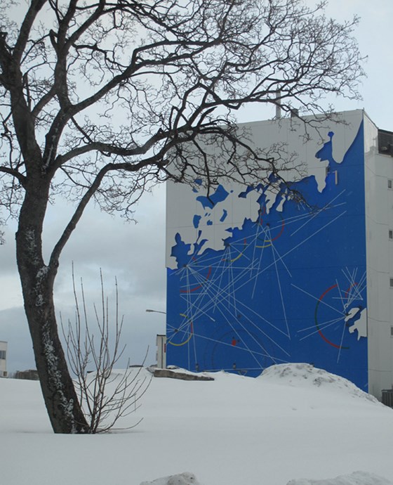
“The building was not only subject to energy consciousness renovations but also a visual makeover,” says Wiig. There was also a desire to transform the building visually with a contemporary design. “White, high-gloss Steni panels were mounted on top of the insulation. But the hot topic of conversation among the people of Svolvær, was the solution the NSW architects chose for a large and empty gable wall towards the harbour park. The north wall of the building is decorated with nautical charts, sector lines and lighthouses – all bathed in bright light on a navy blue background. “Among our architectural tasks was to find a way to satisfy the desire to signal both the Norwegian Fishermen’s Sales Organization’s business area and forward-looking profile, as an enrichment for the outside world.”
Wide variety
The wall decoration is based on a local nautical chart. “Instead of interpretations of schools of fish or other fishing-related motifs, there was more strength in depicting a nautical chart as a three-dimensional interpretation,” says Wiig. It was Steni’s technology that enabled the interpretation of a nautical chart spanning six storeys. “It was natural to use Steni’s façade panels. Steni offers a wide variety of colours, gloss levels and sizes. In Svolvær, we only used glossy panels,” he says. Wiig says that the company is well acquainted with Steni, and has used Steni’s façade panels on several other projects, including at Kystens Hus in Tromsø and Sirkus Shopping in Trondheim, where both glossy and matte façade panels are used.
Useful expertise


